The names of lots of colours or colors are listed here:
http://www.graphviz.org/doc/info/colors.html
ColorBrewer has a nice demo of them too:
http://colorbrewer2.org/
Friday, 24 October 2014
Geomapping from a UK post code...
Very useful resource although I have to do it individually.
http://websemantics.co.uk/online_tools/postcode_to_coordinates_conversion_tool/
http://websemantics.co.uk/online_tools/postcode_to_coordinates_conversion_tool/
Tuesday, 21 October 2014
Analysing cell data for Jim 20141021
Ok, so I have been developing some R-scripts to play with Jim’s cellular data.
The basic data is made up of 57,290 observations of 18 variables.
It is currently imported as a data.frame called “cells”.
I reduced the number of columns in the dataframe to those I believed are the key.
CODE:
#reduce the number of columns in the dataframe
#I have selected these as the Key variables
keyvar <- c('Section','Target','WC.area','WC.488_Int', 'WC.546_Int', 'Nuc.647_Int' )
# This command creates a dataframe that is a subset with fewer columns
subset <- cells[,keyvar]
This reduces the data to just six columns.
Next step is to split the data into individual treatments.
I did this using a map of the plate, prepared in Excel and saved as a csv file.
N.B. Need to be careful to have a space after “A - 1 “ - otherwise first sample includes “A - 10”, “A - 11” and “A - 12”
There should be a way to do this automatically for all of the conditions but I currently have to do some of this by hand.
Arghh - There has to be a loop or some kind of control structure to do this!!!
Next
I need to remove missing values from each of the data sets…
Then draw the density curves and plot them so that they can be output as a nice looking PDF.
Script Name: AllDensityPlots20141021.R
USING ggplot
So the next step is to do the dot plots.
I can get this to work well with the ppErk and the HA staining.
However, the EdU staining is more awkward and I am going to have to ask Jim how he did that.
Script Name: DotPlots20141021.R
Trying to do statistics....
I would like to do some statistics on Jim's data.
I think some kind of ANOVA or MANOVA is the right thing to do but I can't work out how to do it.
I can do the T-tests but that's all at the moment!
This site seems to have a very good ANOVA example:
http://ww2.coastal.edu/kingw/statistics/R-tutorials/repeated.html
There seems to be a requirement to change the format of the data significantly.
I think this can be done but I'm not exactly sure how at the moment.
Because Jim's values have different numbers of observations for each treatment it's not trivial.
I'm pretty sure the ANOVA will allow that but I'm not sure exactly how to assemble the data to make this work.
Monday, 20 October 2014
Dot plots using ggplot....
So I am plying with Jim's cellular data to try to understand and explore it a bit.
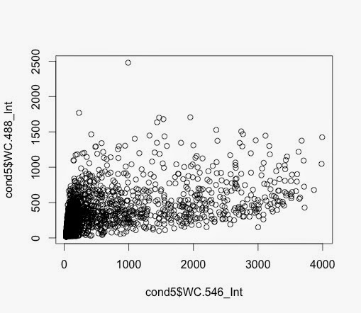
Condition 3 and Condition 5 plotted.
Q61 and V600 - no FBS and DUSPWT
> plot1 <- ggplot(cond5nomiss,
aes(x=WC.546_Int, y=WC.488_Int))
+ geom_point()
> plot1 + scale_y_log10() + scale_x_log10() + geom_density2d()


Condition 3 and Condition 5 plotted.
Q61 and V600 - no FBS and DUSPWT
> plot1 <- ggplot(cond5nomiss,
aes(x=WC.546_Int, y=WC.488_Int))
+ geom_point()
> plot1 + scale_y_log10() + scale_x_log10() + geom_density2d()
This generated this plot - which is V600:
and the equivalent from Q61:
Friday, 17 October 2014
2D density plots....
For 2D plots this seems important
https://stat.ethz.ch/R-manual/R-devel/library/MASS/html/kde2d.html
But I think a
contourplot from the lattice library is a good start.
https://stat.ethz.ch/R-manual/R-devel/library/MASS/html/kde2d.html
But I think a
contourplot from the lattice library is a good start.
missing values...
Code from here:
http://www.statmethods.net/input/missingdata.html
x <- c(1,2,NA,3)
mean(x) # returns NA
mean(x, na.rm=TRUE) # returns 2
Key points is the:
na.rm=TRUE
Useful!
http://www.statmethods.net/input/missingdata.html
x <- c(1,2,NA,3)
mean(x) # returns NA
mean(x, na.rm=TRUE) # returns 2
Key points is the:
na.rm=TRUE
Useful!
Thursday, 16 October 2014
First dot plot of cellular data...
2,330 data points.
Same dot plot for Ctl Virus:
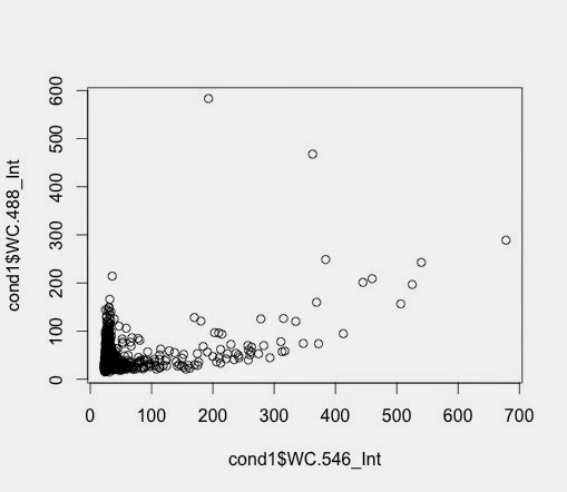
Important to NOTE: Axis are different!!
Nice looking overlays of density plots...
I was supposed to be looking into dot plots but I hit a problem and went back to density plots.
I worked out a nice way to generate overlays that have their own maximum and so look good together.
To do it I adapted useful code from here:
http://robjhyndman.com/hyndsight/r-graph-with-two-y-axes/
Using Jim's cellular data separated into samples previously. The basic graphs are generated with this code:
d5_546<-density(log(cond5$WC.546_Int))
d1_546<-density(log(cond1$WC.546_Int))
Plotting these give individual graphs
plot(d1_546)
plot(d5_546)
when saved gives output like this:


This gives this:

My first attempt at overlaying the plots:
par(mfrow=c(1,1))
plot(d5_546, ylim=c(0,5))
lines(d1_546)
To overlay these and turn them into nice graph
par(mar=c(5,4,4,5)+.1)
plot(d5_546,col="red", main=" ", xlab="", ylab=" ")
par(new=TRUE)
plot(d1_546,col="blue",xaxt="n",yaxt="n",xlab="",ylab="", main="HA staining")
axis(4)
mtext("Cell count-Ctrl Vir",side=4,line=3)
mtext("Cell count-V600",side=2,line=3 )
mtext("Whole Cell Intensity (546nm = HA)",side=1,line=3 )
legend("topright",col=c("red","blue"),lty=1,legend=c("V600","Ctl Vir"))

I worked out a nice way to generate overlays that have their own maximum and so look good together.
To do it I adapted useful code from here:
http://robjhyndman.com/hyndsight/r-graph-with-two-y-axes/
Using Jim's cellular data separated into samples previously. The basic graphs are generated with this code:
d5_546<-density(log(cond5$WC.546_Int))
d1_546<-density(log(cond1$WC.546_Int))
Plotting these give individual graphs
plot(d1_546)
plot(d5_546)
when saved gives output like this:
I can plot these two on the same page
par(mfrow=c(2,1))
plot(d1_546)
plot(d5_546)
This gives this:
My first attempt at overlaying the plots:
par(mfrow=c(1,1))
plot(d5_546, ylim=c(0,5))
lines(d1_546)
Not particularly useful because we lose the other sample.
To overlay these and turn them into nice graph
par(mar=c(5,4,4,5)+.1)
plot(d5_546,col="red", main=" ", xlab="", ylab=" ")
par(new=TRUE)
plot(d1_546,col="blue",xaxt="n",yaxt="n",xlab="",ylab="", main="HA staining")
axis(4)
mtext("Cell count-Ctrl Vir",side=4,line=3)
mtext("Cell count-V600",side=2,line=3 )
mtext("Whole Cell Intensity (546nm = HA)",side=1,line=3 )
legend("topright",col=c("red","blue"),lty=1,legend=c("V600","Ctl Vir"))
This works well to give the following graph:
Some useful links....
Overlaying density plots:
Two ways - one with normal graphics and the other with ggplot:
http://stackoverflow.com/questions/6939136/how-to-overlay-density-plots-in-r
R Tutorials:
A whole list of online free tutorials
http://ww2.coastal.edu/kingw/statistics/R-tutorials/
Running a loop in R:
The basics of a loop
http://www.dummies.com/how-to/content/how-to-loop-through-values-in-r.html
Appending rows to a dataframe:
rbind command from R-cookbook
https://www.inkling.com/read/r-cookbook-paul-teetor-1st/chapter-5/recipe-5-20
How to plot a subset of a data frame in R?
using the "with" command
http://stackoverflow.com/questions/8293547/how-to-plot-a-subset-of-a-data-frame-in-r
Missing data
http://www.statmethods.net/input/missingdata.html
Wednesday, 15 October 2014
Nice plots of multiple graphs...
I suspect the secret of proper batch analysis for Jim is to assemble the data into PDFs that can be shared and discussed.
This requires outputting multiple graphs on one page.
I managed to do this using info from here:
http://www.cookbook-r.com/Graphs/Multiple_graphs_on_one_page_(ggplot2)/
but I'm not very happy with the quality of the output.
ggplot creates some problems with multiple graphs that I don't understand yet.
Using PNG is did output one nice looking data. I don't seem to be able to upload the PNG format to the blog so here is a screen grab:
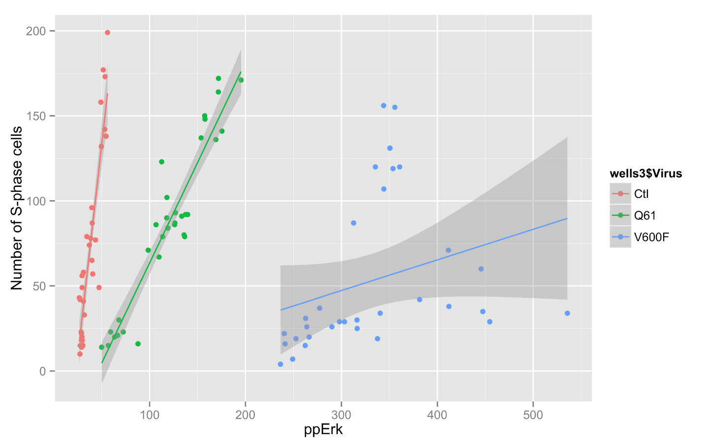
ggplot
I have been using ggplot to generate some more graphs for Jim's data. It allows some very interesting graphs.
Code:
> qplot(ctlvirus$WC.488_Int, ctlvirus$S.phase_cells_Nuc_cnt, data=ctlvirus, geom=c("point", "smooth"),
method="lm", formula=y~x, color=ctlvirus$FBS,
main="Number of S-phase cells Vs pErk staining",
xlab="ppErk", ylab="Number of S-phase cells")
Graph:

Code:
> qplot(ctlvirus$WC.488_Int, ctlvirus$S.phase_cells_Nuc_cnt, data=ctlvirus, geom=c("point", "smooth"),
method="lm", formula=y~x, color=ctlvirus$FBS,
main="Number of S-phase cells Vs pErk staining",
xlab="ppErk", ylab="Number of S-phase cells")
Graph:
2D colour density plot (scatter plot)....
So for Jim Caunt's data, what I really want to do is to generate a 2D colour density plot.
To generate a 2D colour density plot, it requires three sets of values:
To generate a 2D colour density plot, it requires three sets of values:
- X-axis
- Y-axis
- Colour density data.
This is three columns in a data frame.
Some interesting advice here: https://www.biostars.org/p/73193/
As a by the way, I noticed another way to make a new data frame:
DF2 <- data.frame(wells4$WC.488_Int, wells4$WC.546_Int, wells4$S.phase_cells_Nuc_cnt)
This creates a data.frame with the columns from the other data frame.
Useful to know!
I don't really have my head around ggplot yet.
Arghh!
Some useful stuff here: http://www.statmethods.net/advgraphs/ggplot2.html
Tuesday, 14 October 2014
Deleted one value from Jim's data...
This is important to remember!!
I found a negative value which causes a lot of problems when we look at log of the plots.
There was only one so I deleted it!!!
Just a note so that I remember!!!!
I found a negative value which causes a lot of problems when we look at log of the plots.
There was only one so I deleted it!!!
Just a note so that I remember!!!!
Manipulating data frames....
I have learned a little from this post which is all about manipulating data frames:
http://www.r-bloggers.com/select-operations-on-r-data-frames/
It's a little complex but well worth understanding!
for adding columns and rows, it seems like cbind and rbind are the way to go.
However, it's important first to make your columns... they have to be the same size.
http://www.r-bloggers.com/select-operations-on-r-data-frames/
It's a little complex but well worth understanding!
for adding columns and rows, it seems like cbind and rbind are the way to go.
However, it's important first to make your columns... they have to be the same size.
Monday, 13 October 2014
Histograms and density plots...
This is important:
reminder about how to draw both of these with R.
http://www.statmethods.net/graphs/density.html
reminder about how to draw both of these with R.
http://www.statmethods.net/graphs/density.html
Thursday, 9 October 2014
Importing directly from xlsx
So it is possible to read directly into R from xlsx.
It's not trivial but it does seem possible:
See info here:
http://stackoverflow.com/questions/7049272/importing-xlsx-file-into-r
more here:
http://www.milanor.net/blog/?p=779
and here:
http://www.r-bloggers.com/importexport-data-to-and-from-xlsx-files/
It's not trivial but it does seem possible:
See info here:
http://stackoverflow.com/questions/7049272/importing-xlsx-file-into-r
more here:
http://www.milanor.net/blog/?p=779
and here:
http://www.r-bloggers.com/importexport-data-to-and-from-xlsx-files/
Monday, 6 October 2014
Simple graphs in R
This link: http://www.harding.edu/fmccown/r/ has some nice examples.
written by this guy: http://frankmccown.blogspot.co.uk/
However, for R for Biochemists, I think we really need some biochemical examples.
Ideally some:
written by this guy: http://frankmccown.blogspot.co.uk/
However, for R for Biochemists, I think we really need some biochemical examples.
Ideally some:
- Kd and Vmax
- Time courses of protein production
- Perhaps a simple protein assay
- Need some correlation with statistics
- Need some mean, standard deviation.
- Need some T-tests (one sided, paired), ANOVA
- Want to do the multiple graph thing - very useful for data exploration.
- Some grouping algorithms maybe?
- Talk about good quality graphs
- Publication quality.
Interesting piece about R here:
http://stackoverflow.com/questions/3750153/relationship-between-plotting-packages-in-r
gnuplot vs R
http://www.manning-sandbox.com/thread.jspa?threadID=35427
gnuplot is just for graphing!
R is so much more!
Perhaps too much?
Friday, 3 October 2014
Using R - the easy way...
R is an open source statistics package. It's very powerful with lots of statistical models that can be used, lots of great graphics that can be made and most usefully - it's free. If you're interested in numbers, data, statistics, graphs, visualisations - R is one of the best tools there is.
I've spend the last number of months learning how to use R and today I want to give a primer on how to use R to do some simple things. Most of these are things that other packages can do - like Google Documents (but you need internet access) or Excel (but you have to pay for it) but you have to start with the easy stuff.
Your first calculation
Step 1: Download R and unpack it.
Step 2: Download R-Studio and unpack it.
Step 3: Type the following simple text into R-studio:
>3+5
press return
you get:
[1] 8
You've just used R.
Your first graph
> x <- c(1,2,3,4)
> y <- c(2,4,6,8)
> plot(x,y)
>
Import a datafile
Customise a graph
Export a graph.
Using the top box.
Check out RStudio videos
Thursday, 2 October 2014
Making contour plots in R
I am wondering how to make contour plots in R because of a chat I had with Jim from Bath.
It looks very feasible and as usual there are many ways to do it.
Generally, a contour plot of this type has three different kinds of values:
It looks very feasible and as usual there are many ways to do it.
Generally, a contour plot of this type has three different kinds of values:
- a value for the X axis
- a value for the Y axis
- some kind of value for the colour.
Often the X and Y axis are continuous while the colour is a little more categorical although it can be quite continuous.
Searching, as you would, in Google gives some of the following sources:
https://stat.ethz.ch/R-manual/R-devel/library/graphics/html/contour.html
- some very interesting examples here.
https://stat.ethz.ch/R-manual/R-devel/library/graphics/html/filled.contour.html
http://stackoverflow.com/questions/15869969/adding-a-color-key-to-contour-plots-in-r
Subscribe to:
Posts (Atom)