Tuesday 30 June 2015

Geomapping Wales....

There is lots of data available for Wales through a variety of sources.

With the help of a few visiting students, I am trying to work out how to do some geomapping for Wales in R.

Find some maps of Wales

First I have to find a source of some maps.
These are usually in a digital vector format.
The Office for National Statistics has some available here:
https://geoportal.statistics.gov.uk/geoportal/catalog/search/browse/browse.page

Browse the catalogue and look at "digital boundaries".
There are local boundaries of various levels.
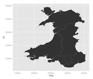
A useful one is the map of boundaries of Local Health Boards in Wales. This was last updated in 2014. It's available here: https://geoportal.statistics.gov.uk/Docs/Boundaries/Local_health_boards_(Wal)_2014_Boundaries_(Generalised_Clipped).zip

The zip file need to be downloaded and placed in a sensible folder. The format of these files is a ESRI shapefile. This can be imported into R.

Lots of health data is gathered and delivered according to Local Health Board. This only divides Wales into 7 regions and they vary by population and many other ways.


Getting the data in to R

I have found two ways so far:
  1. using the readOGR() function from the library(rgdal)
  2. using the readShapeSpatial() function from the library(maptools)

Plotting the data

  • plot() works


  • Using ggplot: ggplot() +  geom_polygon(data=map3, aes(x=long, y=lat, group=group))


Boundaries in the UK


The boundaries in the UK are divided into various levels:

  • Output areas - these are the smallest regions and over 181,000 cover the UK
  • Lower Layer Super Output Areas (LSOAs) - approx 35,000 cover the UK
  • Middle Super Output Areas (MSOAs) - approx 7,000 cover the UK. 
  • Upper Super Output Areas (USOAs) - these are used in Wales but not widely in the UK. 
To draw these (except it seems the USOAs), it's possible to download the maps from the geoportal mentioned above


There is still LOTS to learn about this. 
How do I really add data to this?

Here are some resources:
  • http://blog.revolutionanalytics.com/2009/11/choropleth-map-r-challenge.html
  • http://www.r-bloggers.com/mucking-around-with-maps-schools-and-ethnicity-in-nz/
  • http://www.r-bloggers.com/maps-with-r-and-polygon-boundaries/
  • http://zevross.com/blog/2014/07/16/mapping-in-r-using-the-ggplot2-package/
  • http://prabhasp.com/wp/how-to-make-choropleths-in-r/
  • http://stackoverflow.com/questions/24136868/plot-map-with-values-for-countries-as-color-in-r
  • http://stackoverflow.com/questions/21093399/how-to-turn-gpclibpermit-to-true
  • http://stackoverflow.com/questions/20309883/filling-polygons-of-a-map-using-ggplot-in-r
  • http://stackoverflow.com/questions/24284356/convert-spatialpointsdataframe-to-spatiallinesdataframe-in-r
  • http://cran.r-project.org/web/packages/gdata/vignettes/mapLevels.pdf
  • http://www.inside-r.org/packages/cran/rgdal/docs/ogrInfo
  • http://cran.r-project.org/web/packages/rgdal/rgdal.pdf
  • https://www.nceas.ucsb.edu/scicomp/usecases/ReadWriteESRIShapeFiles
  • http://www.r-bloggers.com/using-r-to-produce-scalable-vector-graphics-for-the-web/
  • http://cran.r-project.org/web/packages/GEOmap/vignettes/GEOmap.pdf
Data sources:

Draw a simple map

It's all shown here: https://www.students.ncl.ac.uk/keith.newman/r/maps-in-r

library(maps) # Provides functions that let us plot the maps library(mapdata) # Contains the hi-resolution points that mark out the countries.

# draw a world map
map('worldHires')


# nice map of Great Britian and Northern Ireland
map('worldHires', c('UK', 'Ireland', 'Isle of Man','Isle of Wight'), xlim=c(-11,3), ylim=c(49,60.9))

Monday 22 June 2015

Interesting links...

http://stackoverflow.com/questions/14441729/read-a-csv-from-github-into-r

http://stackoverflow.com/questions/3979240/r-plotting-a-3d-surface-from-x-y-z


http://cran.r-project.org/web/packages/nlstools/nlstools.pdf


Sir David F. Hendry, Kt

Director, Program in Economic Modeling, Institute for New Economic Thinking at the Oxford Martin School.
http://www.nuff.ox.ac.uk/users/hendry/

Friday 19 June 2015

clustering with p-values...

This R package looks interesting:

pvclust

An R package for hierarchical clustering with p-values

Ryota Suzuki(a) and Hidetoshi Shimodaira(b)

Bootstrapping provides a method for sampling and generating the p-values.
Some information about that here:
http://www.r-bloggers.com/the-cluster-bootstrap/

Wednesday 17 June 2015

form Mark Kelson

Hi Paul,

Here is some R resource that mey be interesting to a clinical trials person.

lme4 package: this fits various hierarchical models
mice package: this has functions for doing loads of things around multiple imputation (a common and preferred method for handling missing data in trials)
pwr package: lots of functions for power calculations
survival package: fits survival analysis

Fun ones
vioplot package: a package I saw recently that fits violin plots to data which I quite like
wesanderson package: a package that provides colour palettes for graphing based on the predominent colours in various Wes Anderson movies


I also attach a document that covers regulatory compliance and validation issues in clinical trials settings for R.

Hope this helps

Mark

ggplot with microscopy data...

Plot distances
facet by size of voxel...


Analysis for high content microscopy AND importing multiple files.

This StackOverload answer:
http://stackoverflow.com/questions/11433432/importing-multiple-csv-files-into-r


So idea of a workflow:

I have 10 files, all from different cells. 
Contain approx 4000 points
Each file has:
position (x,y,z); distance to other protein; which node it's linked to; number of voxels

I have multiple files for each experimental condition...

Plan:
Import all the files. 
Aggregate data from the imported data (rowbind, probably)
Now have 40,000 points

I have this from two experimental conditions. 
Now I want to compare them!

Does treatment change the mean voxel size?
Does treatment change the mean distance?

Is there a relationship between voxel size and number of neighbours?
Is there a relationship between voxel size and the distance?

Q: the mean distance should be the same between the two data sets (HA to FLAG vs FLAG TO HA)
WE CAN CHECK THIS!

Kind of questions that might be interesting:

I guess you could say I'm interested both in trying to ask more from the data I have here (are certain distances over/under represented, are there associations between voxel size and number of neighbors, etc)

What is the pattern/distribution of distances?
Can we describe it mathematically?

What is the pattern/distribution of voxel sizes?
Can we describe it mathematically?


Tuesday 16 June 2015

update r using r-studio - NO!

http://stackoverflow.com/questions/13656699/update-r-using-rstudio

Friday 12 June 2015

Some concepts that merit attention following conversation with Pete.

In non-linear systems, parameters may not be independent. Therefore, great care has to be given to the concept of parameter confidence intervals. It may be better to consider a confidence interval.

These can be calculated using bootstrapping, perhaps.

The nls tools package may be useful to understand and appreciate this.


Robustness test...
   Run your data with 90% of the data, randomly selected.
   If your values change dram

Concept 3
Testing down.
Put all the variables in and take them out one at a time.
Inspired by David F Hendry.


Predicting values from a line and making more complicated lines...

Use the function predict()

predict(results, newdata= data.frame(Area=20), se.fit=TRUE, interval = "confidence")

You can just add variables to the linear model. For example:

results <- lm(data=data, log(Tonn.Hect)~log(Area) + Age + factor(HarvestMoon))


Interesting visualisation package...

The package is called tabplot

require(tabplot)
tableplot(wages, sortCol=Wage)


Copy data from your clipboard...

# for getting it into a PC!
# data=read.delim("clipboard", header=TRUE) # DON'T USE ON MAC!!

# For getting it into a mac!
data <- read.delim(pipe("pbpaste"), header=T)


Mac one from here: http://marcoghislanzoni.com/blog/2013/10/27/import-data-r-mac-os-x-clipboard/

Wednesday 10 June 2015

Tuesday 9 June 2015

Using R to calculate p-values from F-statistic...

I have an F-ratio and I want to know the corresponding p-values.
I need to know the degrees of freedom for the two values used to calculate the F-ratio.

The function pf() is the one to use.

Here is an example:

pf(161.45, df1=1, df2=1, log.p = TRUE)

so the F ratio is 161.45, df1 and df2 is degrees of freedom for the two values.

Returns: -0.05129291

Here is another example:
pf(2.98, 10, 10, log.p = TRUE)

Returns: -0.05120075

Useful information here too: http://www.r-tutor.com/elementary-statistics/probability-distributions/f-distribution

Monday 8 June 2015

Useful links for today...

How to add text to ggplot...
http://www.sthda.com/english/wiki/ggplot2-texts-add-text-annotations-to-a-graph-in-r-software

remove NAs from a data frame
http://stackoverflow.com/questions/4862178/remove-rows-with-nas-in-data-frame


Removing NA from a vector....

NAs cause problems.

Here's how to get rid of them from a vector....


d <- d[!is.na(d)]

from:
http://stackoverflow.com/questions/7706876/r-script-removing-na-values-from-a-vector


Friday 5 June 2015

Putting line breaks into x-axis titles..

This would seem to work!

from here:
http://www.r-bloggers.com/line-breaks-between-words-in-axis-labels-in-ggplot-in-r/

Very useful!!

levels(birds$effect) <- gsub(" ", "\n", levels(birds$effect))
ggplot(birds,
  aes(x = effect,
    y = speed)) +
geom_boxplot()

Playing with fonts

OK, so I couldn't download the xkcd font through R on my mac.
I had to download the font by going to the webpage and then I could install it on the mac.

Then,
font_import(pattern = "[X/x]kcd", prompt=FALSE)
fonts() #shows fonts available in R. 
worked.

This is good.

script:

library(extrafont)
font_import(pattern = "[X/x]kcd", prompt=FALSE)
fonts() #shows fonts available in R. 

font_import() #imports lots of fonts including those below. 

# Type font examples
plot(1:10,1:10,type="n")
text(3,3,"Hello World Default")
text(4,4,family="Arial Black","Hello World from Arial Black")
text(5,5,family="xkcd","Hello World from xkcd")
text(6,6,family="Times New Roman","Hello World from Times New Roman")

Gives this output:
Help from:

http://blog.revolutionanalytics.com/2012/09/how-to-use-your-favorite-fonts-in-r-charts.html
http://stackoverflow.com/questions/12675147/how-can-we-make-xkcd-style-graphs-in-r
http://www.r-bloggers.com/change-fonts-in-ggplot2-and-create-xkcd-style-graphs/
http://xkcdsucks.blogspot.co.uk/2009/03/xkcdsucks-is-proud-to-present-humor.html
http://www.r-bloggers.com/using-r-barplot-with-ggplot2/