Tuesday 18 February 2014

Very simple graphs in R but overlay dot plot and fit line - useful!


http://www.phaget4.org/R/plot.html


R plot symbols

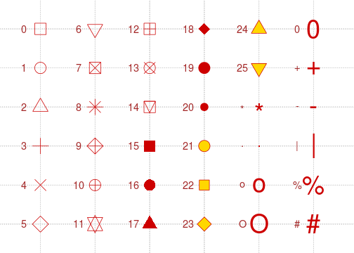
Plot symbols are set within the plot() function by setting the pch parameter (plot character?) equal to an integer between 1 and 25. Since it's hard to remember what symbol each integer represents, the picture below may serve as a reminder. 

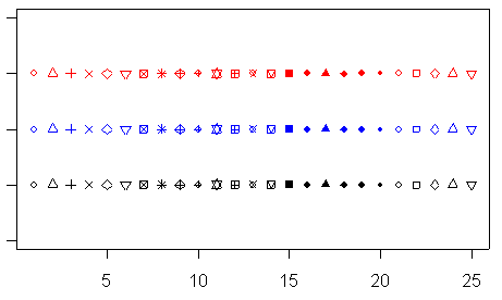
Simple Plot Examples in R

Below are some simple examples of how to plot a line in R, how to fit a line to some points, and how to add more points to a graph. In the first example we simply hand the plot function two vectors. If we handed the plot function only one vector, the x-axis would consist of sequential integers. In the second example we set many different parameters in the plot function, including labeling the axes, setting the range of each axis, setting the plot symbol, and the color to be used, and giving the plot a title.
# Example 1
# make a very simple plot
x <- c(1,3,6,9,12)
y <- c(1.5,2,7,8,15)
plot(x,y)
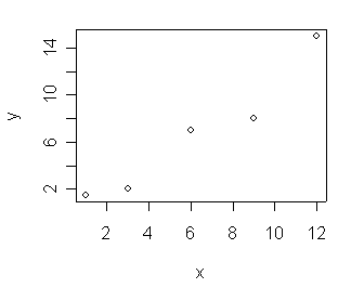
# Example 2. Draw a plot, set a bunch of parameters.
plot(x,y, xlab="x axis", ylab="y axis", main="my plot", ylim=c(0,20), xlim=c(0,20), pch=15, col="blue")# fit a line to the points
myline.fit <- lm(y ~ x)
# get information about the fit
summary(myline.fit)
# draw the fit line on the plot
abline(myline.fit)
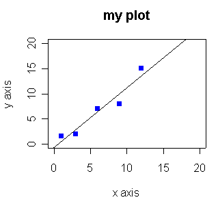
# Example 3
# add some more points to the graph
x2 <- c(0.5, 3, 5, 8, 12)
y2 <- c(0.8, 1, 2, 4, 6)

points(x2, y2, pch=16, col="green")

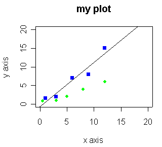
R is available from CRAN at http://cran.r-project.org/
Chris Seidel

Can't control the colours properly....


> dt8$colour
 [1] "red"   "red"   "black" "black" "black" "black" "black" "black" "black" "black" "black"
[12] "black" "black" "black" "black" "black" "black" "black" "black" "black" "black" "black"
[23] "black" "black" "black" "black" "black" "black" "black" "black" "black" "black" "black"
[34] "black" "black" "black" "black" "black" "black" "black" "black" "black" "black" "black"
[45] "black" "black" "black" "black" "black" "black" "black" "black" "black" "black" "black"
[56] "black" "black" "black" "black" "black" "black" "black" "black" "black" "black" "black"
[67] "black" "black" "black" "green" "green" "green" "green" "green" "green" "green" "green"
[78] "green" "green" "green" "green" "green" "green" "green" "green" "green" "green" "green"
[89] "green" "green" "green" "green" "black" "black" "black" "black" "black" "black"
Levels: "black" "green" "red"

So - two red, 23 green and the rest black.

but the command:
> stripplot(data=dt8, height~gender, jitter.data=TRUE, factor=1, cex=2, col=(dt8$colour), pch=16)

has produced this:


with two green, 23 red and the rest black.
How frustrating!!!!


Symbols...

http://vis.supstat.com/2013/04/plotting-symbols-and-color-palettes/

Below is a figure containing the plot symbols from pch = 0 to 25 along with some character-based plot symbols. We can use, for example, plot(x, y, pch = 3) for plus signs (+) in a scatterplot.


plot of chunk pch

stripplot

stripplot(data=dt,height~gender,groups=eye_colour, jitter.data=TRUE, factor=1,pch="o", cex=2, auto.key=list( space="right") )


Help from Peter Morgan

Some info from Peter Morgan...


Hi Paul,

'Cleaned up' the data as attached then tried some things out as follows.  See what you think.

Cheers,

Pete

dt=read.csv("data/studentstats1.csv", header=TRUE)
summary(dt)
# cex makes markers bigger and pch sets the marker shape 
# las = 2 makes the labels go perpendicular to the axes
stripchart(data=dt,height~gender, pch="O", cex=1.5, las=2)
# varwidth sets the box area to be proportional to number of data in any category
# can also add more things to right hand side.e.g. height=gender+eye_colour 
boxplot(data=dt, height~gender, las=2, varwidth=TRUE)
require(lattice)
stripplot(data=dt,height~eye_colour|gender, pch="O", cex=2)
# space is in a list of key drawing parameters - see ?xyplot for details
stripplot(data=dt,height~gender,groups=eye_colour, pch="O", cex=2, auto.key=list( space="right") )
# neat thing to do would be to get colour names in variable to do the colouring!


Monday 17 February 2014

A blog with examples...

http://blogs.bgsu.edu/math6820dtrace/

Strip plots...

stripplot(data2$Gender~data2$height, jitter.data=TRUE, factor=1.6, col=data2$eye_col_R)


more R links...

https://www.zoology.ubc.ca/~schluter/R/


Thursday 13 February 2014

Some Youtube videos

from Statisticsmentor.com
including how to make a survival curve in Excel.
Doesn't look as nice as it could but hey...


Survival curves...

install.packages('survival')
install.packages('KMsurv')

library(survival)
library(KMsurv)

Can't get this to work right now :-(


Tuesday 11 February 2014

Maps....

I would like to get a map of the world and mark off where people are going on their elective.

It's going to take a bit of an effort to get this done by Friday but....

I found an interesting link:
http://www.creativebloq.com/design-tools/data-visualization-712402

and

a feature called Exhibit that looks as if it should do what I want but I don't know for sure...

http://www.simile-widgets.org/exhibit/

I can't work out how the flags are added or what I would need to do to serve this from our blog.

Arghh...