It seems appropriate to do these separately in the first instance.
The workflow is exactly the same but I am doing it at home on a different computer.
>summary(distances)
Min. 1st Qu. Median Mean 3rd Qu. Max.
2.386 5.653 6.844 7.527 9.275 14.110
This looks similar to the range of values yesterday.
Biggest difference: Pat 2 and Pat 3.
Smallest difference: Pat 10 and Patient 11.
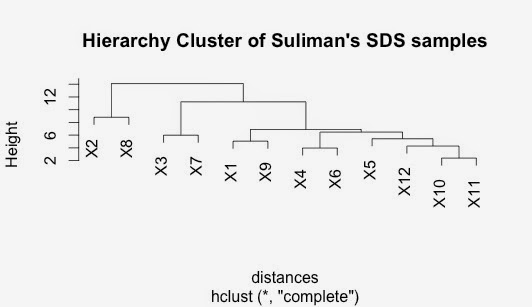
Do hierarchial cluster on this distance matrix
The SDS and the NP40 clusters has some similarities but some differences too.
I don't really know which to focus on at the moment.
I will have to do a little bit more work on this.
Interestingly, the closest sample in both the NP40 data and the SDS data was Patient 10 and Patient 11. Both have very significant correlations.
I think I need to find a way to compare two distance matricies.
However, I am going to try to generate a heat map first. Peter Morgan advised this as a possible option.
I am reading "Visualise This" again as there was a chapter about heatmaps there - starts on page 228.
It is necessary to convert the data into matrix format.
> SDS_matrix <- data.matrix(SDS)
Data is not ordered so this is likely to cause a problem, I think.
Also there are quite a lot of missing values - again likely to cause a problem.
I removed this samples that had any missing data (using Excel). There is a way to do this in R but I got confused.
Then I turned it into a matrix and used the default heatmap options. These include doing a distance measure and clustering. This is the result:
The output is kind of interesting but it seems that most of the proteins do nothing.
It might be worth doing this with the combined NP40 and SDS dataset. This would at least be larger than just the SDS dataset.
Midday now.
I am getting a little distracted and wandering a bit.
I wanted to draw a boxplot of my data.
However this generates this:
This is not very useful!!!
I need to generate the boxplot without the first column of data.
Sadly I don't know how to do that.
A web search found a very nice site for adding detail to boxplots:
but it didn't tell me how to remove that first column.
Mmm, well this command works:
> boxplot(X1, X2, X3, X4, X5, X6, X7, X8, X9, X10, X11, X12)
This gives:
Again, interesting data.
I can make this look a little better by adding labs to X-axis, correcting the spelling error in the title and putting the X and Y labs in bold.
Here it is:
The code for this is:
> boxplot(X1, X2, X3, X4, X5, X6, X7, X8, X9, X10, X11, X12, main="SDS Data plotted by Patient Sample Number", xlab=expression(bold("Patient Samples 1 to 12")), ylab = expression(bold("Relative Quant")), las = 2, names = c("Pat 1","Pat 2","Pat 3","Pat 4","Pat 5","Pat 6","Pat 7","Pat 8","Pat 9","Pat 10","Pat 11","Pat 12"))
Breaking this down a bit:
> boxplot(X1, X2, X3, X4, X5, X6, X7, X8, X9, X10, X11, X12,
+ main="SDS Data plotted by Patient Sample Number",
+ xlab=expression(bold("Patient Samples 1 to 12")),
+ ylab = expression(bold("Relative Quant")),
+ las = 2,
+ names = c("Pat 1","Pat 2","Pat 3","Pat 4","Pat 5","Pat 6","Pat 7","Pat 8","Pat 9","Pat 10","Pat 11","Pat 12")
+)
Remember the data was attached which means that I could use the titles.
Good to learn this stuff.
Enough for now.


No comments:
Post a Comment