I worked out a nice way to generate overlays that have their own maximum and so look good together.
To do it I adapted useful code from here:
http://robjhyndman.com/hyndsight/r-graph-with-two-y-axes/
Using Jim's cellular data separated into samples previously. The basic graphs are generated with this code:
d5_546<-density(log(cond5$WC.546_Int))
d1_546<-density(log(cond1$WC.546_Int))
Plotting these give individual graphs
plot(d1_546)
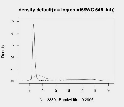
plot(d5_546)
when saved gives output like this:


I can plot these two on the same page
par(mfrow=c(2,1))
plot(d1_546)
plot(d5_546)
This gives this:

My first attempt at overlaying the plots:
par(mfrow=c(1,1))
plot(d5_546, ylim=c(0,5))
lines(d1_546)
Not particularly useful because we lose the other sample.
To overlay these and turn them into nice graph
par(mar=c(5,4,4,5)+.1)
plot(d5_546,col="red", main=" ", xlab="", ylab=" ")
par(new=TRUE)
plot(d1_546,col="blue",xaxt="n",yaxt="n",xlab="",ylab="", main="HA staining")
axis(4)
mtext("Cell count-Ctrl Vir",side=4,line=3)
mtext("Cell count-V600",side=2,line=3 )
mtext("Whole Cell Intensity (546nm = HA)",side=1,line=3 )
legend("topright",col=c("red","blue"),lty=1,legend=c("V600","Ctl Vir"))
This works well to give the following graph:

No comments:
Post a Comment